This web page was produced as an assignment for an undergraduate course at Davidson College.
Synthetic Gene Networks That Count
Summary
The ability to count is quite useful for many digital circuits and could be a very valuable trait for cells as well. A cell could potentially count, for example, biomolecules in order to tightly regulate molecular processes so that it could properly control cellular growth or metabolism. The aim of this research was to genetically modify cells of the genus Escherichia coli so that they could “count” user-determined cellular events. “Count” in this sentence refers to the presence of specific molecules administered to the cells in pulses, for reasons that will be explored later. This paper specifically documents two specific counting apparatuses that count up to three induction events, the first operates via a ribosomal-regulated transcription cascade; the second operates through a DNA recombinase cascade. The mechanisms for these counters are highly specific, depending upon a sequence of specific actions, and are examined below. The application of these cellular counters is vast and has great potential.
Figures
Figure 1

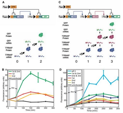
A) This figure displays the circuit diagram of the riboregulated transcriptional cascade two-counter. The strands are segments of episomal DNA, which were artificially inserted into E. coli. Grey rectangles represent promoters, strands of DNA that elements can bind to in order to promote transcription, and other elements on the stand are either genes or regulatory components. Triangular arrow heads signify induction and direction of transcription, and flat arrow heads indicate repression. “RBS” stands for ribosome binding site, where the ribosome bonds to initiate translation on the transcribed mRNA. Notice on both stands of RNA this essential binding site is repressed by an adjacent portion of DNA labeled “cr”. RBS is inhibited by this cis element of DNA because when transcribed next to RBS, the mRNA of cr forms a secondary structure in a stem –loop formation that partially covers RBS and prevents the 30S ribosomal subunit from binding and thus translating the remaining mRNA. However cr can be inhibited by and a strand of mRNA encoded for by the portion of DNA labeled taRNA. taRNA binds to cr, preventing the stem-loop secondary structure from impeding translation. PBAD promotes taRNA. PBAD is activated by a monosaccharide called arabinose. taRNA’s mRNA will repress both depicted cr repressors, allowing for the translation of both T7 RNAP and GFP (the proteins at the ends of the mRNA molecules) if their transcripts are present. The gene that promotes the cr-RBS-T7 RNAP mRNA is Ptet0-1, and was not described to have any regulation, and would therefore always produce the cr-RBS-T7 RNAP transcript. Thus if the cells were exposed to arabinose, the T7 RNAP protein would be translated. T7 RNAP stands for T7 ribonucleic acid polymerase, which activates the promoter, PT7, of the other mRNA strand (cr-RBS-GFP). Thus when T7 RNAP is present, the cr-RBS-GFP transcript would be produced. However, this transcript also has a cr element. Thus one pulse of arabinose would lead to the production of the GFP transcript, but two arabinose pulses would be required for GFP translation, hence the name riboregulated transcriptional cascade two-counter. This system can count (detect) a specific (in this case two) number of arabinose pulses. Notice that separate transcription and translation effects must happen in order for GFP to be produced, and that this system is regulated by both cis and trans regulatory elements. GFP stands for green fluorescent protein, which fluoresces and can be detected and quantified. The bottom of the figure merely pictorially shows that T7 RNAP would be produced after one arabinose pulse, and that both t7 RNAP and GFP would be present after two arabinose pulses.
B) This figure shows flow cytometry data, graphed as amount of fluorescence (in arbitrary units) over time. Notice the time scale is in minutes, to allow the cellular components to transcribe and translate the proper mRNAs. The vertical grey rectangles represent when the cells were exposed to the arabinose pulses. The black line shows uninduced cells fluorescence and serves as the negative control in the experiment. The yellow and red lines show the cells fluorescence when exposed to exclusively the first or second pulse respectively. Notice their fluorescence was slightly elevated compared to the controls, probably due to the robustness (leakiness) of the system. But neither of these lines approach the green line, which is the fluorescence of the cells exposed to both pulses, which is substantially higher than any other line. Error bars are given and do not appear to overlap.
C) This figure shows the riboregulated transcriptional cascade three-counter, and mirrors figure 1A, except there is an additional step, making the required number of arabinose pulses three instead of two. In this diagram, PT7 promotes the production of a transcript including T3 RNAP, which, if translated, will promote the GFP transcript, which would then theoretically have to be translated to display fluorescence. The bottom of this figure likewise shows which proteins would be produced after sequential arabinose pulses.
D) Much like figure 1B, this graph also shows the flow cytometry data as amount of fluorescence (in arbitrary units) in various strands of cells graphed over time (once again, in minutes). The vertical grey rectangles still represent when the cells were exposed to the arabinose pulses. Once more the black line shows uninduced cells fluorescence and serves as the negative control in the experiment. The yellow, red, and light green lines show the cells fluorescence when exposed to exclusively the first, second, or third pulse respectively. Notice their fluorescence was slightly elevated compared to the controls, again probably due to the noisiness of the system. The dark green and dark blue lines represent cells given the first and second or the second and third pulses respectively, and their fluorescence are slightly higher than even those given only one pulse, suggesting that each pulse causes some noise. But none of these lines approach the light blue line, which is the fluorescence of the cells exposed to all three pulses, which is substantially higher than any other line. Error lines are again given and do not appear to overlap.
Figure 2
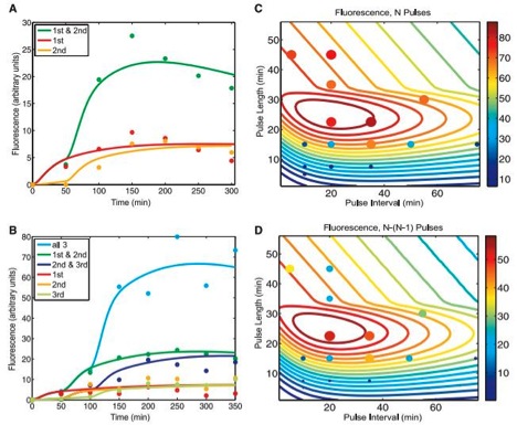
A) This figure shows expected (solid lines) and experimental (dots) flow cytometry data for the riboregulated transcriptional cascade two-counter, once again graphed as fluorescence (in arbitrary units) over time (in minutes). The solid lines represent expected values based off of a mathematical model used to predict behavior of the counter, accounting for its noisy tendencies. The dots correlate to actual experimental data, and can be fit to the chart shown in figure 1B. The color code is kept consistent with that in figure 1B. The point of this graph is to show that their model appears to fairly accurately predict the counter’s function.
B) This figure, much like figure 2A, this graph displays (solid lines) and experimental (dots) flow cytometry data for the riboregulated transcriptional cascade three-counter, once again graphed as fluorescence (in arbitrary units) over time (in minutes). The solid lines were generated by their mathematical model, which once again accounted for the robustness of the system. The dots directly correspond to the data in figure 1D, and the color code is the very same as in 1D. Again, the point of this chart is show that the function of the counter can be fairly well predicted with their mathematical model.
C) Based off the model used to make predictions in figure 2B, the scientists altered the pulse duration and plotted it against pulse frequency for cells exposed to three (N) pulses. The color of the contour lines represents the intensity of the proposed fluorescence based of the model used to predict the solid lines in 2B, and the legend for the corresponding intensity of these colors is on the right side of the graph. The dot’s size and color represent actual data collected from cells exposed to the corresponding pulse strength and frequency. They state that the large region of high fluorescence represents the robustness of the system. Also, notice that when either the frequency or strength of the pulse was too high or low, the cells would not fluoresce due to the intrinsic kinetic limitations of the molecules, such as transcription and degradation. They use this graph to once again argue their model can make fairly accurate predictions. Still, the most dramatic pulse length and interval are important considerations when using this application, and there is a pretty well-defined highest intensity range on this chart.
D) Extremely similar to figure 2C, except the graphed data now represent the difference in output after three (N) and two (N-1) pulses, to compare what fluorescence was detected above, presumably, background levels. The solid contour lines once again represent the predictions and the dots denote experimental values. They claim this graph further supports the accuracy of their models.
Figure 3
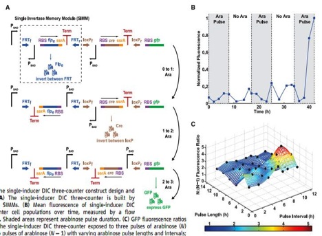
A) This is a pictorial representation of how a DNA invertase cascade three-counter works. This counter registers a count by permanently flipping portions of the DNA, denoted single invertase memory modules (SIMMs). These modules consists of an inverted (relative to how the unit should be transcribed), arabinose activated promoter, PBAD, an RBS, flpe, a recombinase gene that will transcribe an enzyme that will cut the DNA at specific sites and invert that piece of DNA, ssrA, a tag that will lead the quick degradation of the flpe protein, a transcription terminator (Term), and two site that the encoded recombinase protein will cut and flip at, in the first SIMM outlined by the dashed box in the top strand FRTf and FRTr. The whole first SIMM is initiated by a PBAD, which is activated in the presence of arabinose. Once arabinose is present, the flpe will be transcribed and translated, which will flip the whole SIMM, properly orienting the previously inverted PBAD into an orientation where it can initiated the flip of the next SIMM, which in this case uses cre as its recombinase, which produces a recombinase that cuts and flips at the loxPf and loxPr sites. This second SIMM again contains an inverted PBAD promoter, and if another arabinose pulse initiate transcription and translation of cre, will be properly oriented to stimulate the transcription of RBS and gfp. Notice an arabinose pulse will result in a permanent rearrangement of DNA. Therefore these changes counters can count for event that happen over the lifetime of the cell, yet the signals still need to be at least hours apart, due to the time needed to reorient the DNA.
B) This graph shows the results of the DNA invertase cascade three-counter when exposed to arabinose pulses (represented as grey boxes) over hours of time. The data are graphed in normalized fluorescence, where the cells final fluorescence is set as 1. Notice the dramatic increase in fluorescence at the onset of the third pulse, indicating the system worked as designed. There is still minimal fluorescence at other times, accounted for by the noise in the system. However, there are no controls or error bars plotted on this chart, which would have been nice to see.
C) This is a three dimensional representation of pulse frequency, pulse intensity, and fluorescence intensity, graphed as a ratio of the DNA invertase cascade three counter exposed to three pulses over the DNA invertase cascade three counter exposed to two pulses, which serve as a control to compare against. The surface represents the prediction made by a mathematical model that accounts for the robustness in the system and the black dots plotted represent experimental findings and fit the model quite remarkably. The researches pointed out at all points the surface was above 1.5, indicating three pulses should always fluoresce more than two pulses for the three counter. The color key at the bottom of the chart represents fluorescence intensity and just makes seeing the intensity easier. The most dramatic pulse length and interval are important things to consider when using this application, and there is a clear, well-defined peak on this chart.
Figure 4
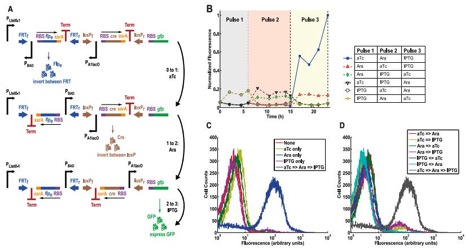
A) This figure shows another DNA invertase cascade three-counter that employs different promoters in order to detect a specific sequence of different signal molecules. The first upright promoter that initiates the potential cascade is PLtet0-1, and is activated by anhydrotetracycline (aTc). The second, inverted promoted is once again PBAD, which is activated by arabinose. The third inverted promoter is PA1lac0, which is activated by isopropyl β-D-1thiogalactopyranoside (IPTG). The cascade still performs the same, just responds to a series of specific molecular pulses instead of just one input and will still produce GFP if the correct sequence of signals is given. This graph demonstrates the potential for the system to be tightly controlled and highly specific.
B) This is a chart displaying normalized fluorescence (to the greatest amount of fluorescence achieved) over time (hours) for various sequences of administered signals, at the various times represented by the different colored backgrounds labeled “Pulse 1”, “Pulse 2”, and “Pulse 3”. As the figure displays, the cells that received the predicted (from 4A: aTc then arabinose then IPTG) were the strain of cells who represented a substantial amount of greater fluorescence than any other strain. There is still some background fluorescence, due to the noisiness of the system. However this graph still shows that the counter worked as intended.
C) This graph shows the cell count versus fluorescence for cells exposed to nothing (a negative control), one of the promoter’s activators, or all three activators in proper predicted sequence. As we can see, the fluorescence was drastically higher in cells exposed to the proper sequence of activators compared to the control or the other conditions (which had no significant difference from the control). Thus the only cells that displayed greater than background fluorescence were those subjected to the predict activators in sequence.
D) Much like 4C, this figure shows the cell count versus fluorescence for cells exposed any combination of two of the promoter’s activators or all three activators in proper predicted sequence. As we can see, the fluorescence was drastically higher in cells exposed to the proper sequence of activators compared to any of the other experimental conditions. Thus the only cells that displayed substantial fluorescence were those subjected to the predicted activators in the expected sequence.
My Opinion
Upon my first read through, I found this paper quite dense and complicated. However, with a little closer examination, I found I understood the material well. I found the topic of this paper fascinating, and found the authors did a pretty good job of explaining a complex phenomenon. I thought that the data were generally well presented and found their results more convincing than other papers we’ve read this semester.
I did find a few flaws within the figures however. I thought that the bottom portions of figure1A and figure 1C were not necessary or particularly helpful, and would most likely not be beneficial to many of the readers of this paper. I was the most hesitant to see the conclusions they reached from figure 2C and figure 2D. These two figures seem spacious and highly redundant. Also, the dots from experimental data in the figure don’t seem to correlate very well with the theoretical contour lines. They do get closer as one approaches the intensity maximum, which is perhaps the most important part, but still many of the dots seem significantly off. It would have been nice of them to have included a graphed control in figure 3B. And in figure 4C and figure 4D I noticed that the cell counts of the cells subjected to the predicted order of activators seemed to be slightly lower (approximately 100 cells each time, corresponding to about a 28.5% difference) than any other cell counts, especially since these counts seemed fairly consistent. Is it possible this DNA alteration or the signals themselves had some negative effect of cellular survival? If so, this would bear tremendous implications of the use of these technologies. And just in general a little more consistency with data presentation would’ve been helpful. In some cases they use arbitrary units; in other cases they normalize their data. Is this just to make trends apparent? A skeptical scientist must question all presented data. Also, when error bars were given (which was only in one figure), they authors did not let us know what they represented, a crucial mistake. More error bars and their significance would have been helpful.
Their mathematical models seemed, in most cases, to fairly accurately predict the behavior of the system, which speaks to how well they understood the counter. Still I wondered if they first made the model then gathered the data, which could then support or refute their model, or if they first gathered data then made a model to try to fit the collected information. Still the predictability of a biological circuit is very elusive and is always a desirable goal of genomics.
Still their data was fairly believable. I suggest further research into these technologies, for if this technology is viable, it could have grand applications. They have designed riboregulated counters that operate on a scale of hours, a time frame very useful for many cellular events such as cell division. One suggested use is a counter that triggers apoptosis in engineered cells after they have divided a certain number of times, to ensure the cells don’t get out of hand. The DNA invertase counters operate on minimally hour time scales, but result in permanent changes. Such counters could register events over lifetimes, if desired. These counters could measure how many times an individual encounters something in its environment or other various biosensing applications. The many uses of this technology, if successful, have only been briefly considered in this paper.
References
Questions? Comments? Contact me at mike.nuttle@comcast.net