This web page was produced as an assignment for an undergraduate course at Davidson College.
Analysis of Figures |
Conclusion and References |
|---|
Hartman et al., 2009
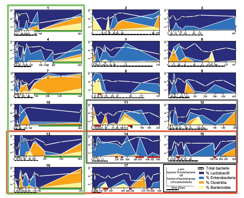
This figure represents the microbial populations as measured by qPCR in all 17 SBT participants. The x-axis represents time in days, which is variable depending on each patient’s timeline of ileostomy sampling. There were four different types of bacteria that comprised the intestinal effluent samples of all participants: Lactobacilli and Enterobacteria (facultative) and Clostridia and Bacteroides (anaerobic). The proportions of bacteria varied and researchers attempted to group the participants together in their attempt to find correlations between these fluctuations. The red box represents a specific genetic mutation in a protein responsible for intestinal health, the green box represents patients whose ileostomy was closed and the black box represents patients who died during the study. Data suggested that no clinical factor studied by the researchers accounted for such variability. The main importance of this figure is that the facultative bacteria (Lactobacilli and Enterobacteria) were generally more abundant than the anaerobic bacteria indicating a trend and a deviation from “normal” in microbial populations within the gut in SBT participants.
Hartman et al., 2009
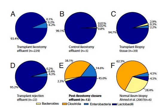
Six pie graphs represent the relative bacterial proportions from the effluent intestinal samples taken under different settings. The pie graphs are labeled in the diagram. Pie graphs E and F are the only studies done when the ileostomy was closed or not present to begin with. Chart F is a control of a “normal” individual’s gut flora, indicating that Bacteroides and Clostridia (both anaerobic bacteria) are present in dominant proportions in “normal” individuals. The only other pie chart with dominant Bacteroides and Clostridia populations is chart E, which is also the only other chart that shares the similar characteristic of a closed ileostomy. The other four charts rule out that the SBT may be responsible for the shift in bacterial population dominance by accounting for the presence of ileotomies in effluent SBT, effluent non-SBT, biopsy SBT, and effluent SBT rejection individuals. In all four cases the reverse dominance, as compared to the “normal” individuals, of bacterial population was present in the gut.
Hartman et al., 2009
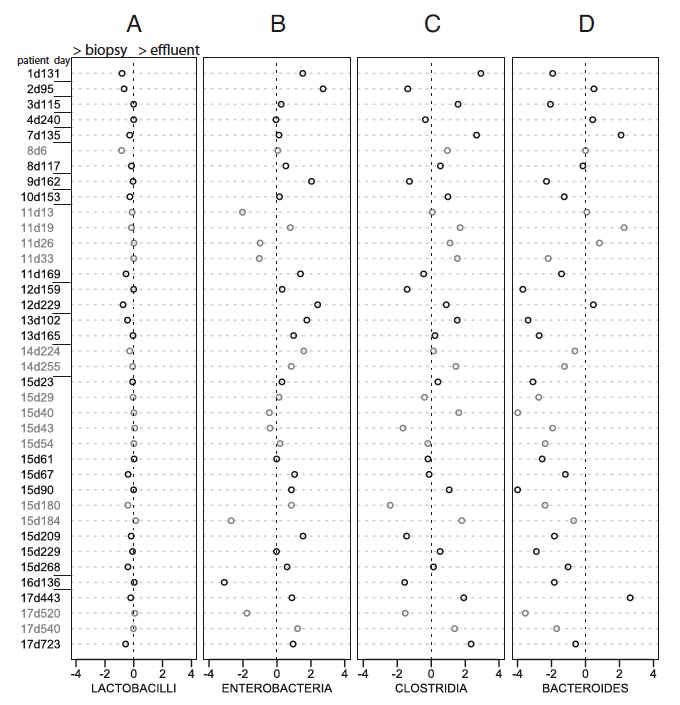
In this figure researchers were attempting to determine if bacterial populations were the same for the effluent (liquid) samples and biopsy samples of the lining of the intestinal wall when taken from the same individual at the same time. Each column of the figure represents the analysis of one of the four main types of bacteria found in the gut and their relative population percentages were measured using qPCR. The labels to the left of the columns indicate the patient number and the number of days (d) after the SBT. The circles themselves represent the log10(biopsy percentage of bacteria / effluent perentage of bacteria) for that particular type of bacteria. If the bacterial populations are the same no matter where they are taken from then the numerical log value should be 0. If there is a greater percentage of that particular type of bacteria in the effluent sample as compared to the biopsy sample, then the numerical log analysis will be a negative number. Finally, if there is positive log outcome, then the bacterial percentage in the biopsy is greater than that in the effluent sample. The numbers on the x-axis of each column quantify the extent to which the bacteria percentage may vary in each sampling method. For instance, a -2 indicates that the effluent sample had 100 times more of that particular bacterium than the biopsy. Finally the difference between the gray and black circles indicates graft rejection and health respectively for the sample studied. The researchers claim from this figure that the biopsy and effluent sampling methods produce similar results of bacteria population proportions. I am unsure of the statistical ranges they utilized while analyzing this data, but at first glance it appears as if some of the bacteria population percentages are not well conserved between the two methodologies; for instance the Bacteroides appear to vary considerable, favoring an increase in population in the effluent samples over the biopsy samples.
Hartman et al., 2009
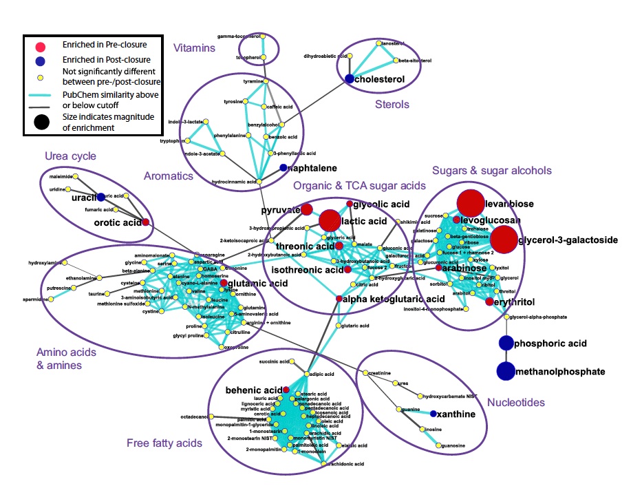
Researchers analyzed the metabolism of pre and post-closure individuals via mass spectrometry metabolomic profiling methods. The metabolic network diagram, constructed above, is a bit confusing, but it is meant to highlight the 62 statistically different metabolites between the pre and post-closure samples. First it is important to notice that the metabolites are grouped together according to structural similarity and not function. I think it may have been more helpful to group the metabolites according to function. Secondly, the main point of the diagram is communicated via red and blue dots. The red dots indicate metabolites that were more prevalent in pre-closure samples and the blue indicates metabolites that were more frequent in post-closure intestinal environments. The conclusion drawn from this diagram is that in pre-closure individuals, where oxygen exists and facultative bacteria thrive in dominant proportions, metabolites involved in oxidative respirations (Krebs cycle) are enhanced. This data is a bit complex but indicates that microbial communities in our intestines play an important role in sensing and communicating with our bodies.
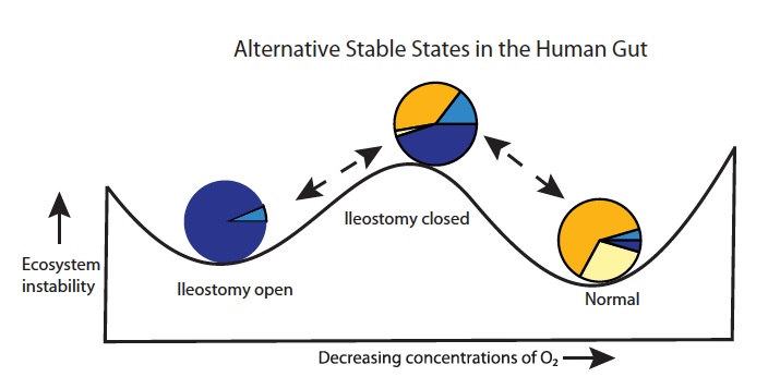
Hartman et al., 2009
Although researchers showed that microbial populations shifted from anaerobic to facultative due to ileostomies, they also surpringly found that this shift did not seem to disturb the human intestine drastically. Figure five represents the possible phases of the human intestinal microbial community in patients with ileostomies. The pie charts themselves are taken from figure two (A, D and E respectively). The horizontal axis represents oxygen concentrating in the small bowel and as is indicated in the drawing when the ileostomy exists oxygen may diffuse through and the small bowel not only has higher concentrations of oxygen but also a different proportional bacterial community. The diagram also indicates the ease of returning to a “normal” small intestinal state once the ileostomy is closed. Although returning to such a state of “normal” anaerobic microbial concentrations may take time, which is indicated by the upward slope in the diagram. Overall this diagram indicates the phases of the small bowel bacterial ecosystem overtime and is dependent on the existence of ileostomy (oxygen).