Synthetic Gene Networks that Count
This webpage contains a brief review of a paper entitled “Synthetic Gene Networks that Count”. All figures and facts come from this paper by Friedland et. al 2009. The first section includes a basic summary of the paper. This is followed by a brief summary of each figure and my final conclusions.
Review
The authors of this paper demonstrate two novel systems for counting events within a cell. One is called the “riboregulated transcriptional cascade counter” (RTC) and the other called the “DNA invertase cascade counter” (DIC). The RTC design regulates transcription by inducing promoters and regulates translation through riboregulators and their cis/trans elements. A computer model, backed by experimental data, shows this design is ideally suited to detect environmental stimulations on the scale of minutes (Fig 1B). That is, the stimulation lasts for several minutes and the time between stimulations is several minutes. Alternatively, the DIC design relies on DNA recombination dynamics. A computer model, backed by experimental data, shows this design is ideally suited to detect environmental stimulations on the scale of hours (Fig 3C). That is, the stimulation lasts for hours and the time between stimulations is hours.
As a proof of concept, both of these counting systems are implemented inside of Escherichia coli cells. These cells are shown to be capable of counting up to 3 environmental stimulation events. It is important to note that in this implementation, results, in the form of fluorescence from a reporter gene (GFP), are only seen in the 3rd event. Although each stimulation causes a different protein to be produced, you do not see the stimulation result until the 3rd stimulation. Additionally, although the authors count only up to 3, they present compelling evidence that such systems can be expanded to count more events.
Figure 1
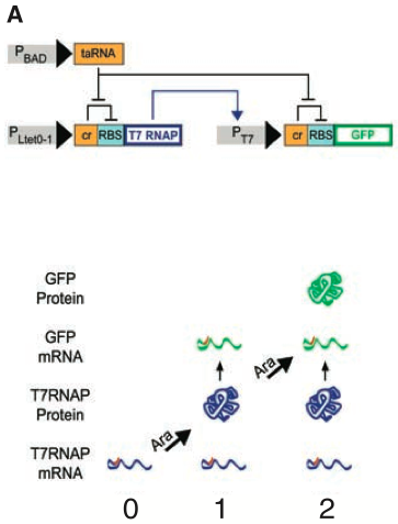
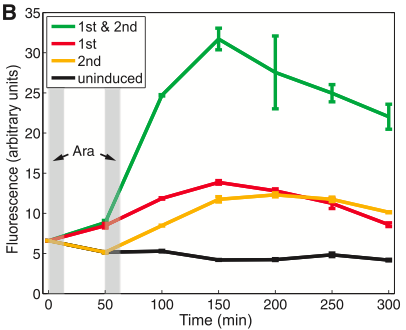
Figure 1A depicts a 2-RTC-counter construct. The PLtet0-1 promoter drives the transcription of T7 RNA polymerase necessary for transcription of the PT7 promoter, driving GFP. Additionally, both promoters are also regulated by riboregulators. The cis elements of these riboregulators, labeled as cr (yellow box before RBS aqua box), inhibit gene expression, while the trans element, labeled as taRNA, blocks the cis elements, allowing gene expression. The trans element is controlled by the PBAD promotor. This promoter is induced by arabinose and allows the system to count brief arabinose pulses. This implementation is capable of counting up to 2 brief arabinose pulses. The first event synthesizes T7 RNA polymerase. However, before much of T7 RNA polymerase can bind to PT7, the burst is over, stopping repression of the cr element. So, although T7 RNA polymerase is in the cell, GFP cannot be translated because of the cr element. The second pulse of arabinose represses the cr element again, allowing GFP to be transcribed. This is an excellent figure. It is very clear and accurately describes the system.
Figure 1B shows the mean the level of fluorescence for cells measured by a flow cytometer. As you can see, there is some leaky translation of GFP, so GFP is not “off” until 2 induction events occur. The black trace shows uninduced cells have a very low level of fluorescence; this is the base background leaky translation or the control. Both the red and yellow traces show slightly increased levels of fluorescence after 1 total pulse of arabinose. The red trace cells received their only pulse in the first pulse time slot (first grey bar), and the yellow trace shows cells that received their only pulse in the second pulse time slot (second grey bar). The green trace shows there is substantial increase in the fluorescence when two induction events occur, so that one can clearly tell when 2 induction events have occurred from when 1 or no induction events have occurred. The error bars on this graph are clear and support the conclusion that this system works.
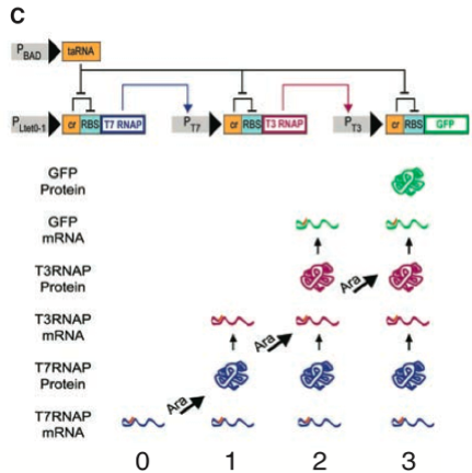
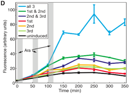
Figure 1C depicts a 3-RTC-counter construct. As in the first construct, counting is achieved through transcriptional and translational regulation. However in this construct, an additional transcriptional regulator is added - the T3 RNAP gene. T3 RNAP is translated after two arabinose pulses and induces the transcription of the GFP mRNA located behind the PT3 promoter. As before, this figure is easy to read and captures all of the information at hand.
Figure 1D shows the mean the level of fluorescence for cells measured by a flow cytometer. Again in cells that received a single pulse of arabinose, we see a slight increase from the baseline fluorescence in uninduced cells (black trace). In cells that received only two pulses (dark green and dark blue traces), there is a larger increase in fluorescence than in the cells that received a single pulse. Interestingly, the level of fluorescence in these cells appears to be comparable to the level of fluorescence of the cells in 1B that received 2 pulses of arabinose (green trace 1B). However, this is not a completely valid comparison as you can see the baseline and all other subsequent constructs exhibit more florescence than those in 1B. There may be more leaky translation in this construct, but again cells that received 3 pulses of arabinose are clearly identifiable from the other cells. Relative to the other cells, these cells are extremely induced. As in figure 1B, this graph is easy to interpret and supports the authors’ assertions.
Figure 2
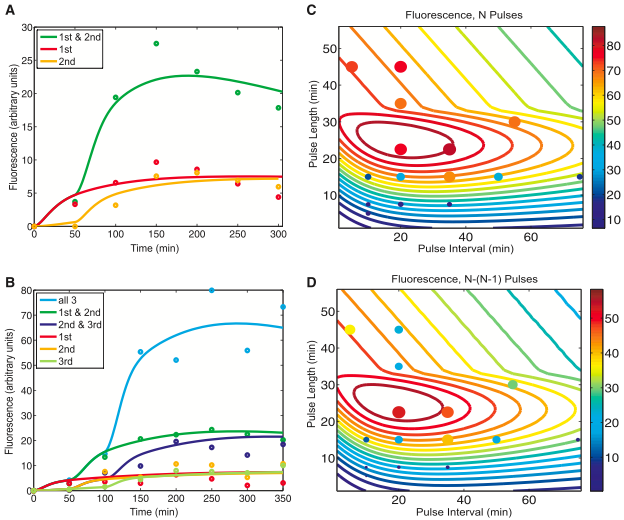
Figure 2 is generated from a computer model simulation whose parameters reflect the experimental results of figure 1. Figures 2A and 2B show the computer model captures the general trends of the data from previous figure 1. Figures 2C and 2D show further predictions based on this model. From panels 2C and 2D the authors conclude that the maximum expression levels of GFP occur with pulse lengths of ~20 to 30 minutes and pulse intervals of ~10 to 40 minutes. Finally, this computer model is used to argue the robustness of the system as long as the pulse frequency is neither too high or too low.
- Figure 2A shows the computer model fitted with the data from figure 1B. The dots on the graph represent the actual points in 1B that gave the same color coded trace in 1B. The lines are the predictions of the computer model, using the same color code as in 1B. This figure shows that with these parameters, the computer model roughly approximates the expression of GFP in a 2-counter RTC system. It sets the stage for the predictions made using this model in panels 2C and 2D. The authors do a great job of color coding this graph and making it easy to interpret.
- Figure 2B is similar to 2A, except that it correlates with figure 1D. Again, with this set of parameters, the computer model roughly approximates the expression of GFP in a 3-counter RTC system.
- Figure 2C uses the same parameters as in 2B, so N pulses equals 3. It shows predictions of the GFP fluorescence in a 2-counter RTC system though a range of pulse lengths and intervals. The combinations of pulse lengths and intervals between pulses constitute the x and y axis respectively. The predictions of the amount of GFP output is shown by the color of the line, which correlates to the gradient column on the left. The dots are experimental results colored according to the same scale and whose size also represents the level of expression. This graph is a contour plot, a 2-D representation of a 3-D gradient. The color gradient is basically the Z axis compressed into 2-D. This means that a blue dot on top of a red line is beneath that line in 3-D space. Just based on the computer model this graph tells us a pulse length window of ~20 to 30 minutes will produce the maximum amount of fluorescence regardless of the pulse interval. However, the maximum amount of fluorescence after N pulses falls within the pulse length window of ~20 to 30 minutes and the pulse interval window of ~10 to 38 minutes. Overall, the experimental data (dots) seem to correlate with the computer predictions; however, in the 10 to 20 pulse length range, it seems the computer model is not as effective in predicting the system outcome. Here the computer predicts ~50 to 60 fluorescence units, but the data gives ~20 to 40 fluorescence units.
- Figure 2D also uses the same parameters as 2B. It also shows predictions of the GFP fluorescence in a 3-counter RTC system though a range of pulse lengths and intervals. However, this graph shows the absolute difference in expression output after N (3) pulses and N-1 (2) pulses. This means the higher the number of predicted fluorescence (more red), the more profound the difference is between N and N-1 pulses. In this graph, the experimental data does not align as nicely with the computer prediction as in 2C. For example, at a ~35 minute pulse length and a 20 minute pulse interval the simulation predicts ~45 fluorescence units while the data says ~15 units. However, you would expect this difference as it is much harder to predict both N and N-1 fluorescence with high accuracy. That is, there is more room for error and random behavior in the cell that is hard to predict. Both figures 2C and 2D are packed with information. At first I found the graphs somewhat intimidating; however, once you are able to visualize what the graph means the data is very clear. It is also very impressive and useful that the authors developed such a model. The model gives them greater insight into their system that would have been difficult to otherwise obtain. Imagine doing so many small incremental tests in the wetlab!
Figure 3
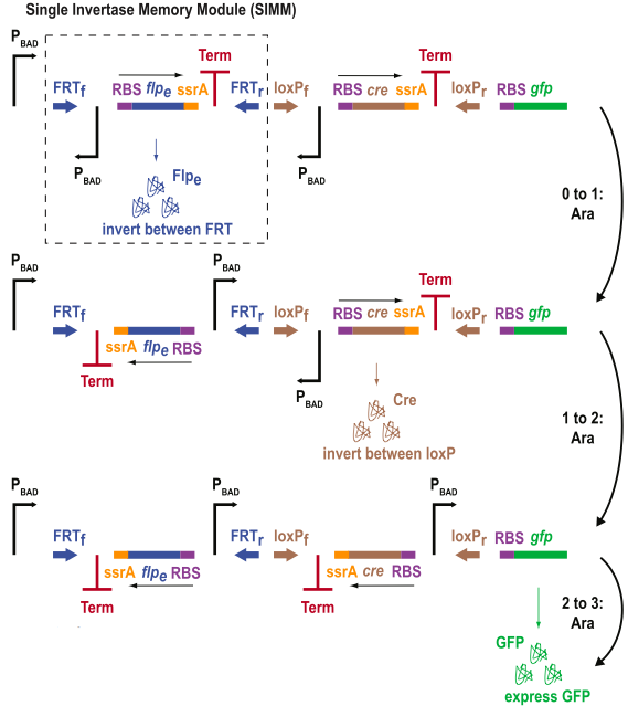
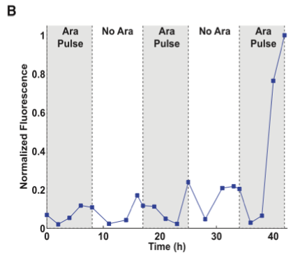
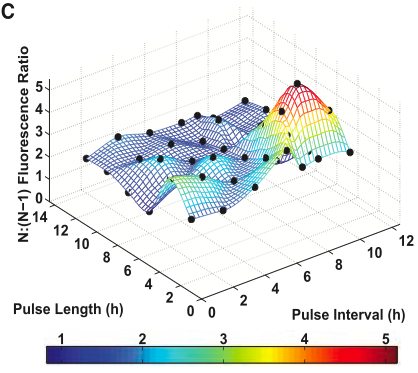
Figure 3 shows data from a 3-DIC-counter construct. This construct represents a single inducer system because all of the promoters, PBAD, are induced by arabinose.
- Figure 3A is a diagram of the 3-DIC-counter construct. As you can see, this system is composed of smaller modules called single invertase memory modules (SIMM). These modules consist of an inverted promoter (PBAD) and a recombinase (either Cre or flpe). These recombinase genes are followed by a ssrA tag (that allows for rapid protein degradation) and a transcriptional terminator. These SIMMs are placed in order in the construct. When PBAD is induced the first time, it drives the production of flpe which flips the first SIMM. Because of the ssrA tag, flpe rapidly degrades and is not able to flip the first SIMM again (back to the original position). Now, the system is poised for the second flip as the terminator is replaced by a promoter. In the next arabinose pulse Cre is produced. This flips the second SIMM, so that there is now a promoter in position to drive GFP. Furthermore, also note that with the second arabinose pulse, no more flpe is produced because the open reading frame of flpe is facing the opposite direction needed for transcription. As with the previous diagrams, this figure is easy to read and very accurate.
- Figure 3B is similar to figures 1C and 1D; however, the values in this trace have been normalized. As you can see there is some leaky transcription in the Cre recombinase SIMM. However, in the third pulse there is a dramatic increase in GFP expression. The data in this figure is clear; however I do not particularly like this figure, as this figure could have been presented in the same style as figure 1D. It is easier for the reader to follow data in figures and graphs if they are presented in a consistent way. This way, the reader does not have to “re-learn” how to interpret a graph and can focus on the data. Furthermore, for the skeptical reader a change in visualizations may make the reader more skeptical of the results. It may cause the reader to wonder whether the authors are manipulating the presentation to visually “skew” the results for their argument. In this case, I do not believe this is the authors’ intention; however, it does raise some red flags. Also note that there are no error bars on this figure which indicates the experiment may only have been performed once.
- Figure 3C shows the fluorescence ratio of N (3) pulses to N-1 (2) pulses. The black dots represent experimental results. The color scale shows the ratio of the fluorescence at N pulses to that at N-1 pulses. So, the more red the color is, the more profound the increase in fluorescence at pulse N (3) when compared to the previous pulse, N-1 (2). This figure demonstrates that the 3-count, single inducer DIC system is able count pulses whose lengths and intervals vary from 2 to 12 hours. Again, the authors changed visualization methods. This graph is essentially 2C and 2D in a 3-D format instead of 2-D. In 3D version it is easier to make out peaks, but it is more difficult to see the experimental points. This is much clearer in 2C and 2D; however, it is more difficult to conceptualize the 3-D information those graphs are trying to tell you. Originally, I thought this graph was also generated from a computer model, as in 2C and 2D; however, after closely reading the text I think it is simply a graph plotting data from several experiments in 3-D space. Perhaps this is the reason the authors chose to change visualizations, but they should have made this more clear to the reader. Even after reading the article several times, it is not overwhelmingly clear that this graph is not based on a computer simulation.
Figure 4
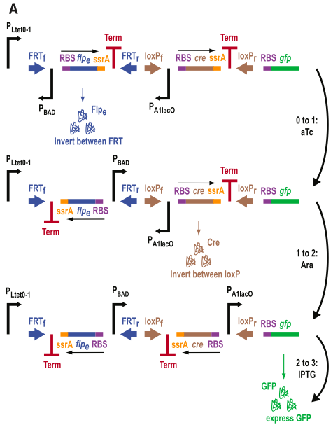
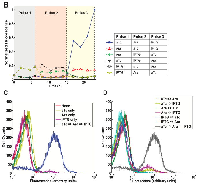
Figure 4 shows from a 3-DIC-counter construct. This system is a multiple inducer system, as different inputs activate each stage.
- Figure 4A is diagram similar to the one in figure 3A. However, here notice that the promoters are different for each SIMM. Each of these promoters has a unique input that it counts. The promoters in order of they appear are PLtet0-1, PBAD, and PA1lac0. Thus, the first input measured is aTc, then arabinose, and finally IPTG. In theory, these molecules must appear in that order, otherwise they will not be counted. Again, another excellent diagram.
- Figure 4B shows the characterization of this construct. As you can see when the pulses appear in order, the GFP expression increases tremendously. It is also interesting to note that PA1lac0 appears to have some leaky transcription in the presence of IPTG. That is, whenever IPTG is present, regardless of its position in the pulses (whether it is 1st, 2nd, or last), a small fluorescence spike occurs. This is interesting to note because it could be a “leaky” property of the PA1lac0 promotor, or just a property of the construct (and cell) meaning any promotor would do the same. Based on the previous construct, figure 3A, it seems likely that the spike is not necessarily because of the promoter, as the 3A construct’s fluorescence slightly spikes at every arabinose pulse. This figure depicts a nicely controlled experiment that tests every combination of 3 inputs. It provides solid evidence for the robustness of the DIC system.
- Figure 4C shows the cell count of the number of cells with a specific fluorescence. Comparing all of the curves to the blue curve shows us that there is much more variance in the fluorescence of the cells given the 3 pulses in correct order. This makes sense as you have more chances to randomly not flip a SIMM or have more background noise. The four other traces are nearly identical. The IPTG only trace aligns nearly perfectly to the background noise (fluorescence) of the cell, shown by the pink control trace. The arabinose and aTc only traces are also very close to the normal, although many of these cells showed a slight increase in fluorescence.
- Figure 4D is the same as figure 4C except that it includes only pairwise combinations of inputs (pulses) and the final 3 pulse sequence. The data here behaves as one would predict. The traces of the cells with two inputs align in a similar pattern to the traces with one input in 4C. This suggests that the system is robust and would not prematurely induce the final 3rd SIMM (GFP).
Conclusions
Overall, this is a very persuasive paper. The authors develop two novel counting systems inside the cell and provide very convincing data. Figure 1 shows proof of concept of the first, RTC, system. This data is immediately followed by figure 2 which shows further characterization of the system. Figure 3 shows proof of concept of the second, DIC, system. And figure 4 shows very compelling data on the robustness and flexibility of that system.
In my opinion, the authors demonstrate excellent science. The authors create, test, and characterize a new synthetic system. They show the robustness of the systems with their various tests, the potential scalability of the systems particularly with the modularity of the SIMMs, and the flexibility of the systems most notably in the different inputs for DIC system. Again, it is also impressive that they developed a counting system for both fast, quick environmental exposures and intervals and for slow, prolonged environmental exposures and intervals. Finally, this paper highlights the promise of synthetic biology and is at the cutting edge in this field.
Works Cited
Friedland AE, Lu TK, Wang X, Shi D, Church G, Collins JJ. Synthetic Gene Networks that Count. Science. 2009 May 29;324: 1199–1202.